
Case studySports nutrition
Lime on black for a supplement brand that sells on quick-commerce apps
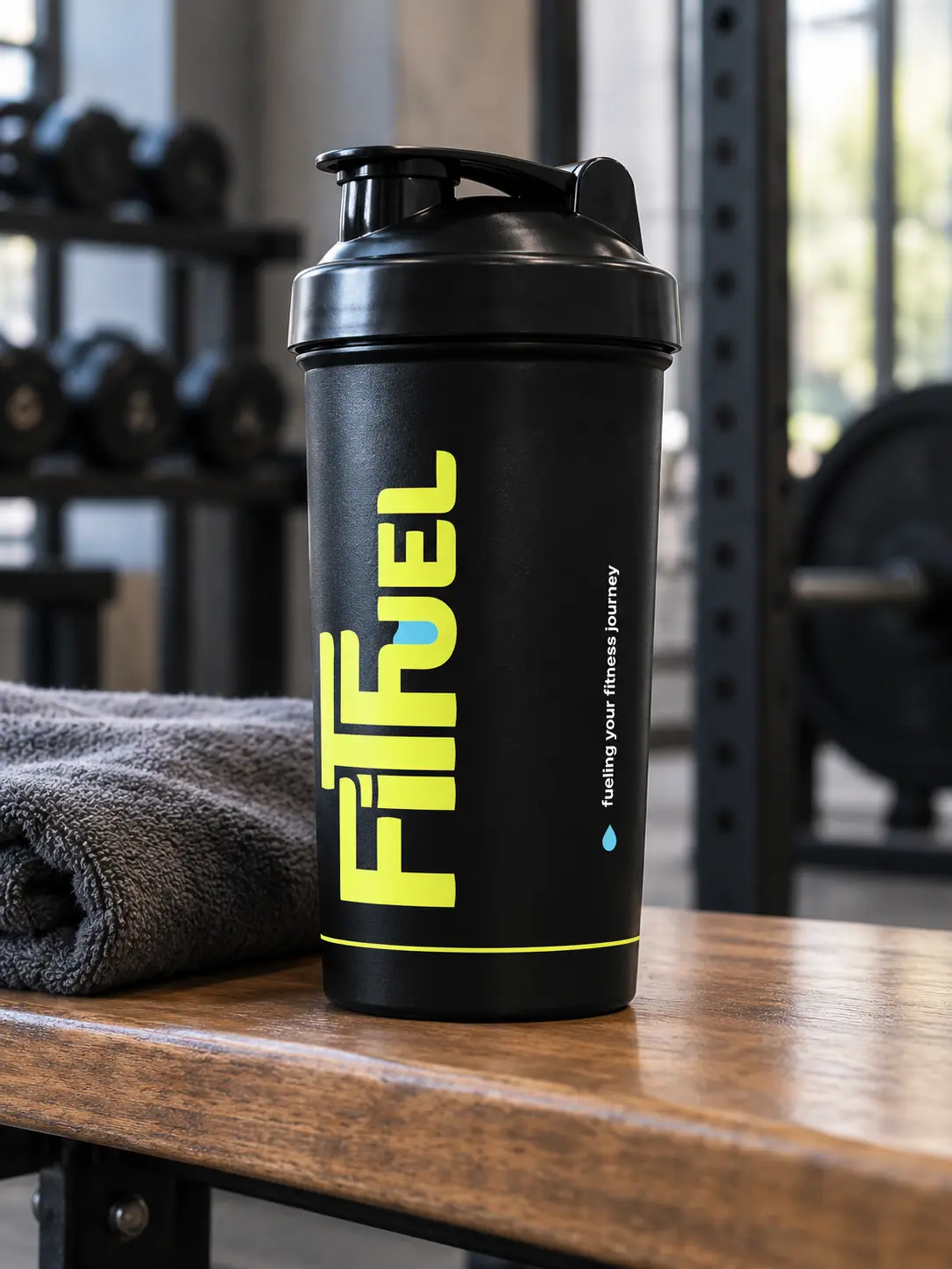
FitFuel sells protein and supplements through Amazon, Zepto, Blinkit, Swiggy Instamart and Flipkart. The wordmark is chunky and stencil-cut, with a drop of cyan in the U, in lime on near-black. We made the identity, a whey tub, cards, posts and a mobile site, then filled out the range.
The idea
On a quick-commerce app a tub is a thumbnail among dozens. So the mark is chunky and cut like a stencil, lime on near-black, and it still reads at the size of a fingernail.
The identity
First shown as a six-slide carousel: the wordmark, its lime tile, the mark on photographs, a post, the whey tub and a card.
01 The wordmark 
02 The lime tile 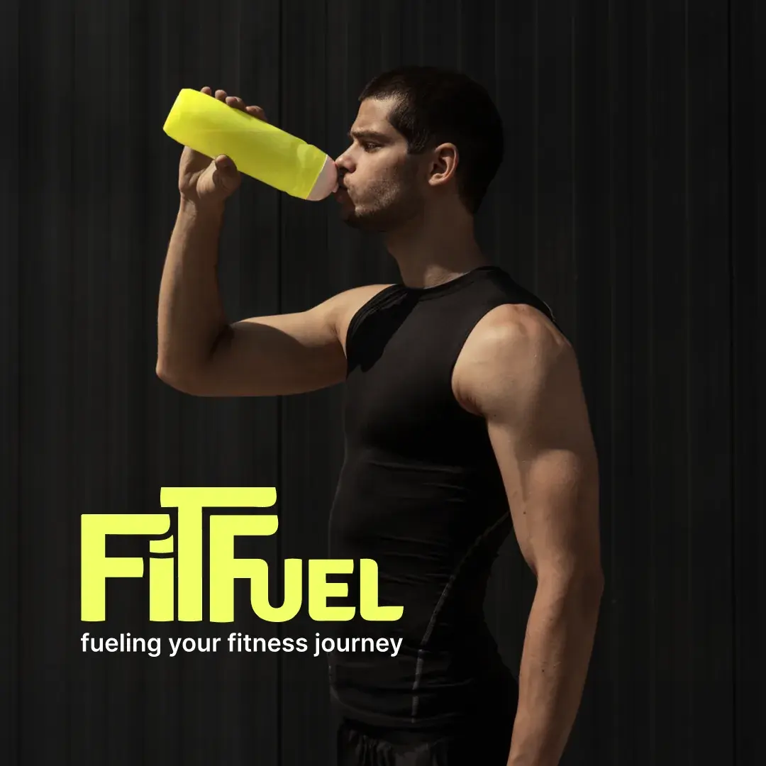
03 On a photograph 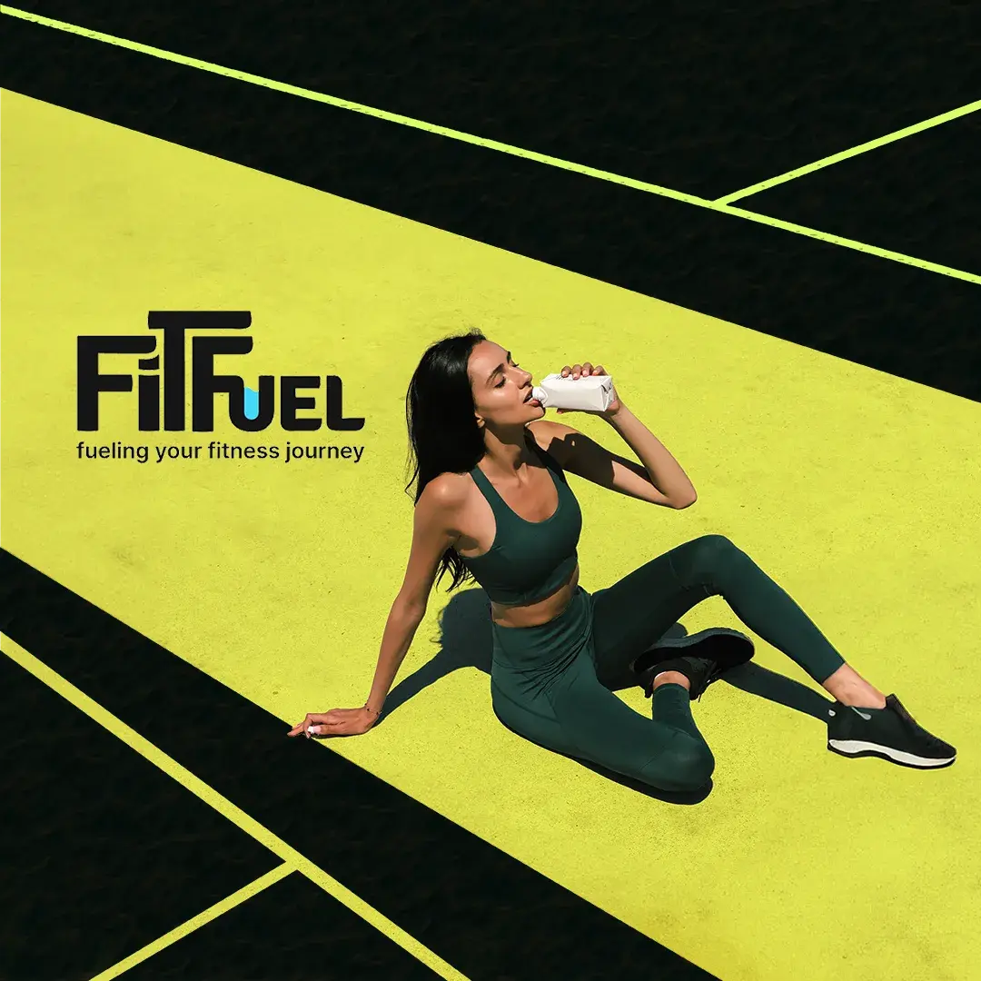
04 A post 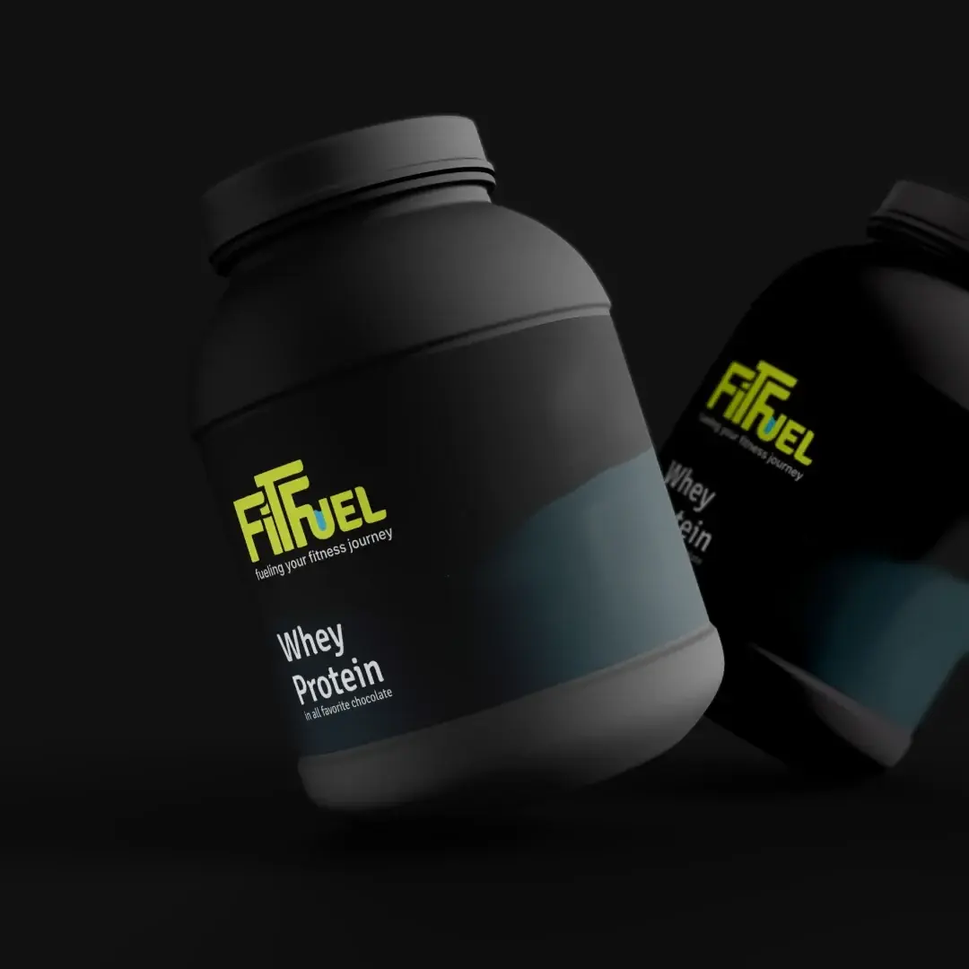
05 The whey tub 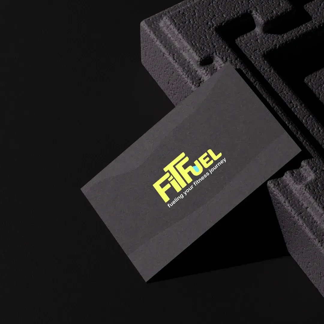
06 The card
Colour and type
Lime and near-black do the work. Cyan appears once, as the drop in the U, and white is for type.
- LimeThe ground and the mark
- Near-blackEverything else
- CyanOnly the drop
- WhiteType
- Space Grotesk
- Pack names and headings, set tight.
- Fira Sans
- Everything read up close: directions, the net weight, the site.
The range
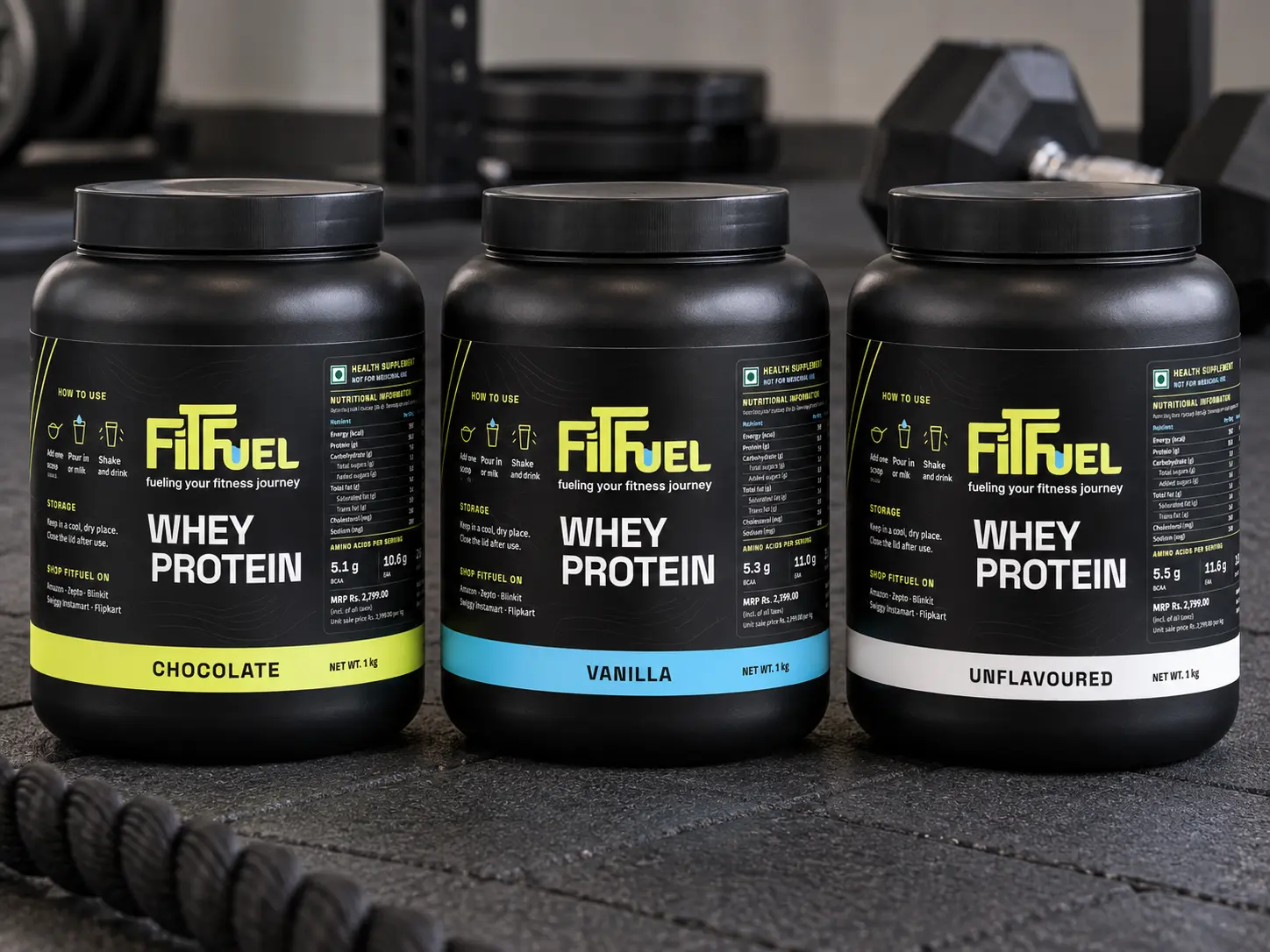
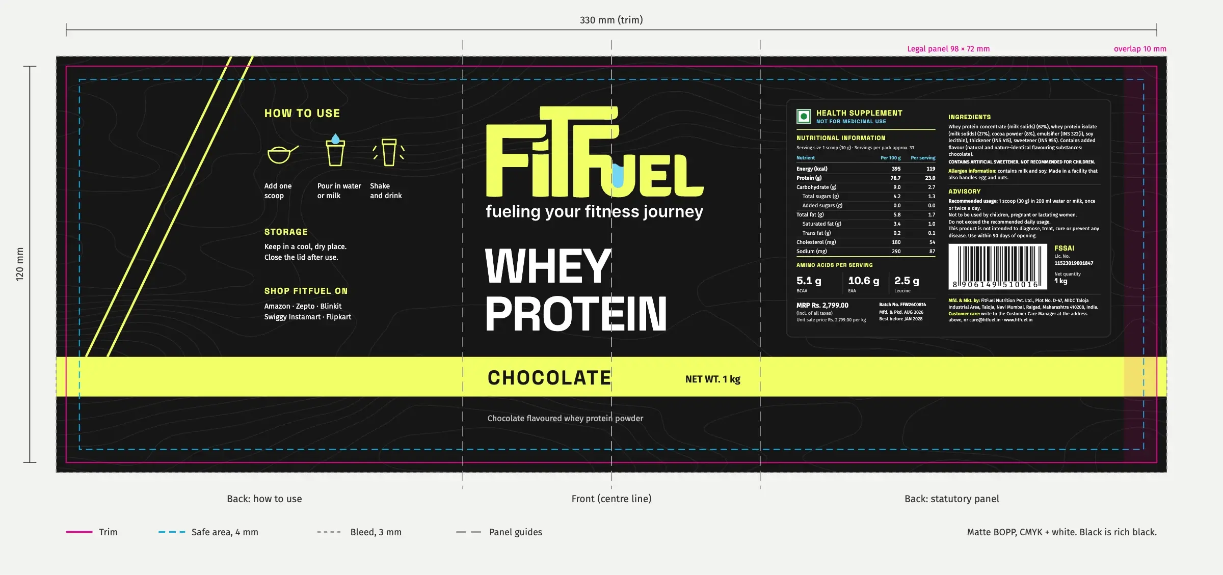
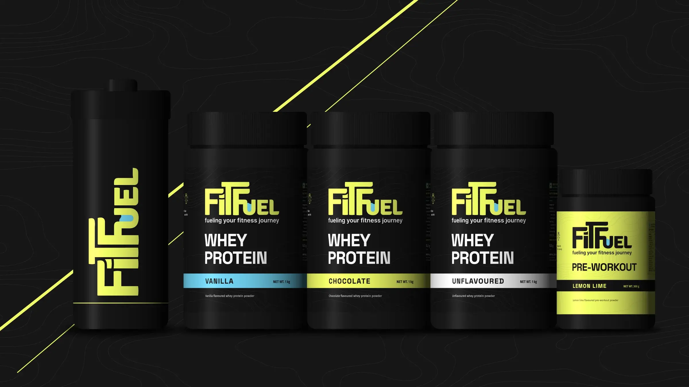
The whey tub came with the identity. We carried it across a range: three flavours told apart by a band of colour, a lime pre-workout that turns the whey inside out, and a shaker.
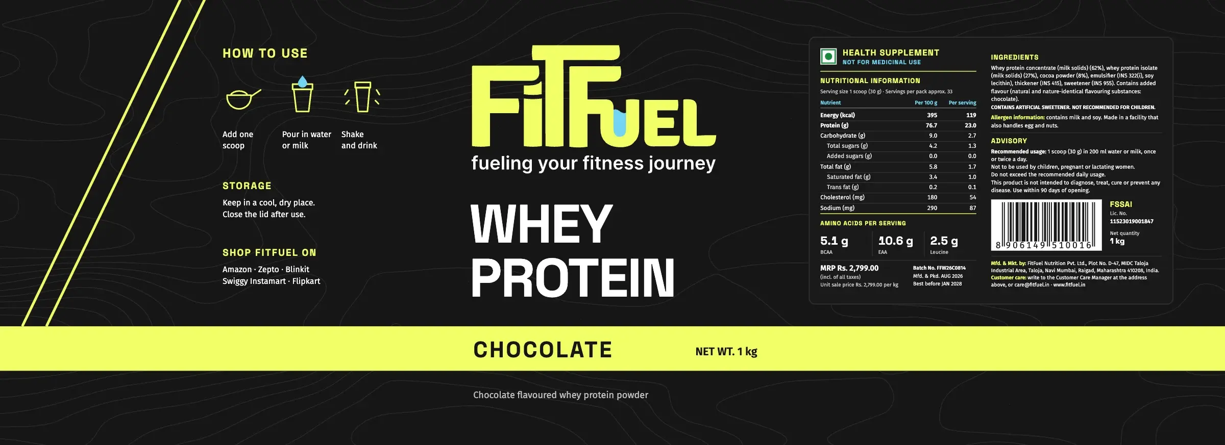
Flavour names on the new packs are proposals. The back panels carry sample ingredients, nutrition, FSSAI, MRP and barcode details for the mockups, not FitFuel’s own.
The labels, flat
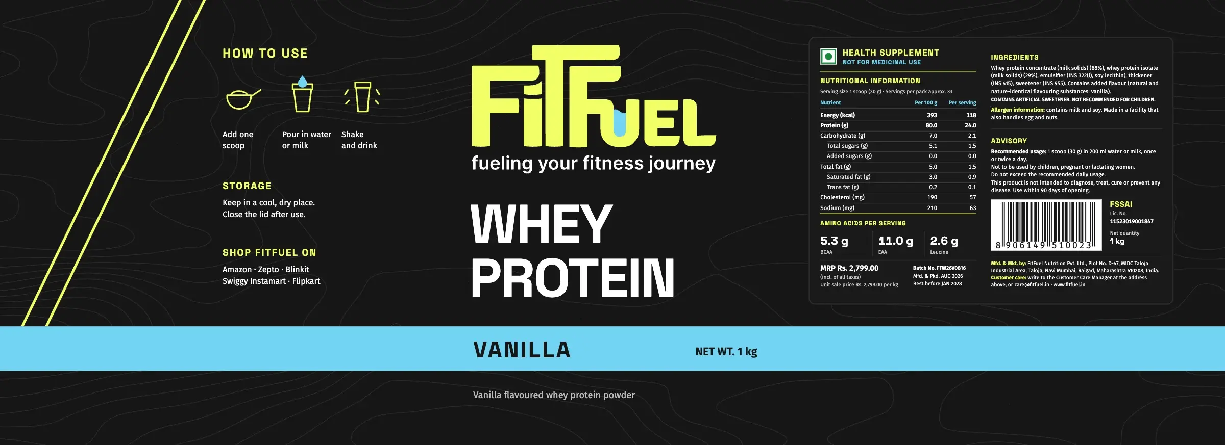
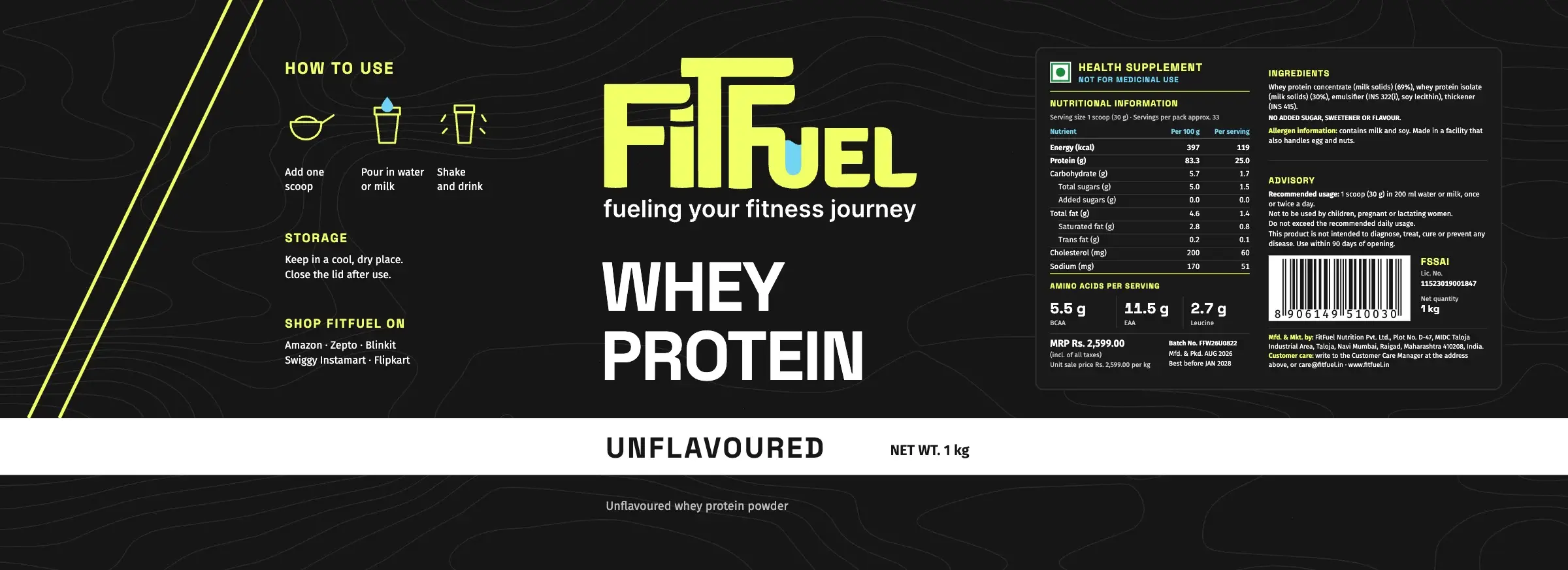
Chocolate, vanilla and unflavoured: one layout, three bands.
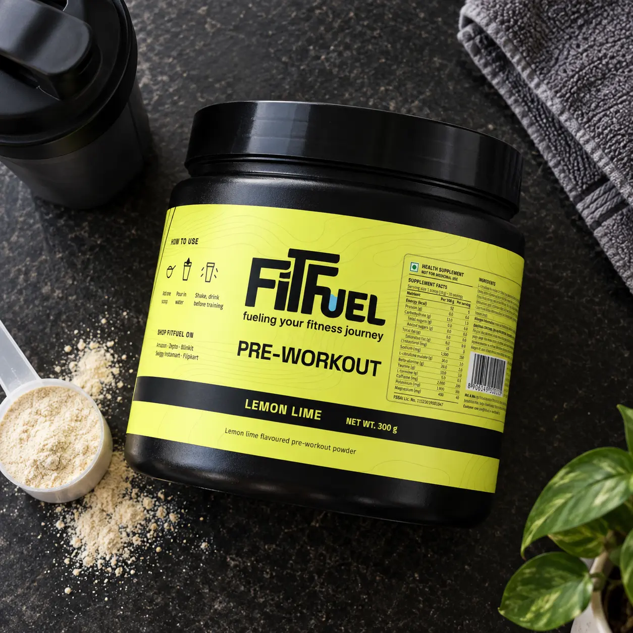
The website
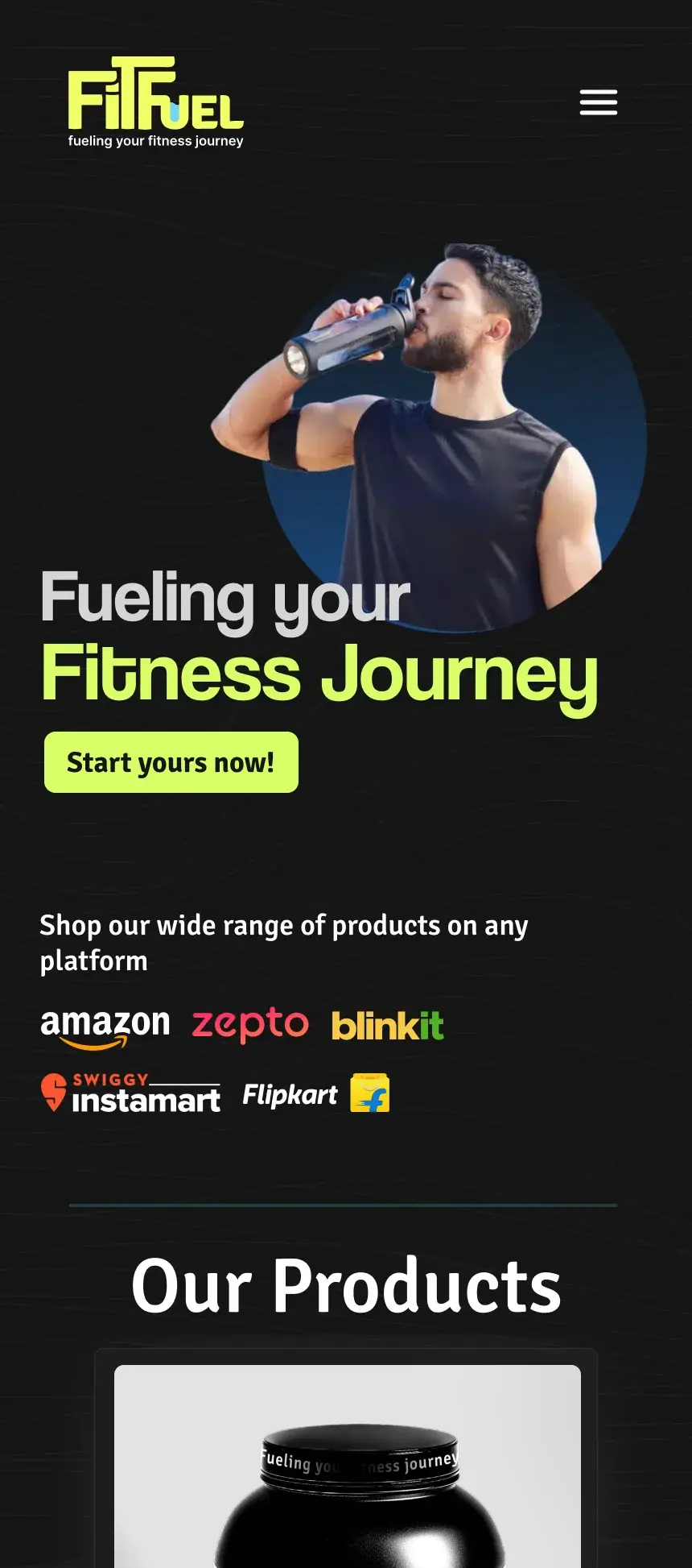
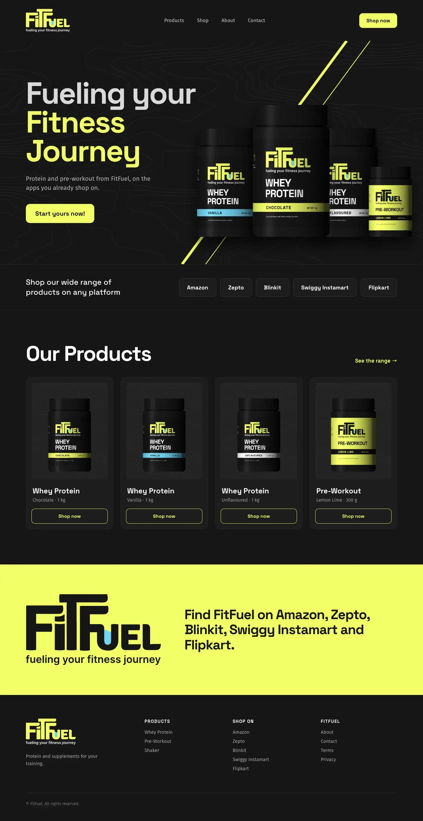
The site sends people straight to the app they already use, then shows the range. Scroll to read down each page.
Credits
- Client
- FitFuel
- Industry
- Sports nutrition
- What we did
- Identity design
- Packaging design
- UI/UX design
- Social media design
The flavour range, pre-workout, shaker and desktop page extend the identity; flavour names are proposals.