
Healthcare / home care
MediCare at Home
A home-care brand and website that reads well at any age
- Services
- Identity design · UI/UX design · Website development · Print design · Social media design
- Year
- 2024, redesigned 2026
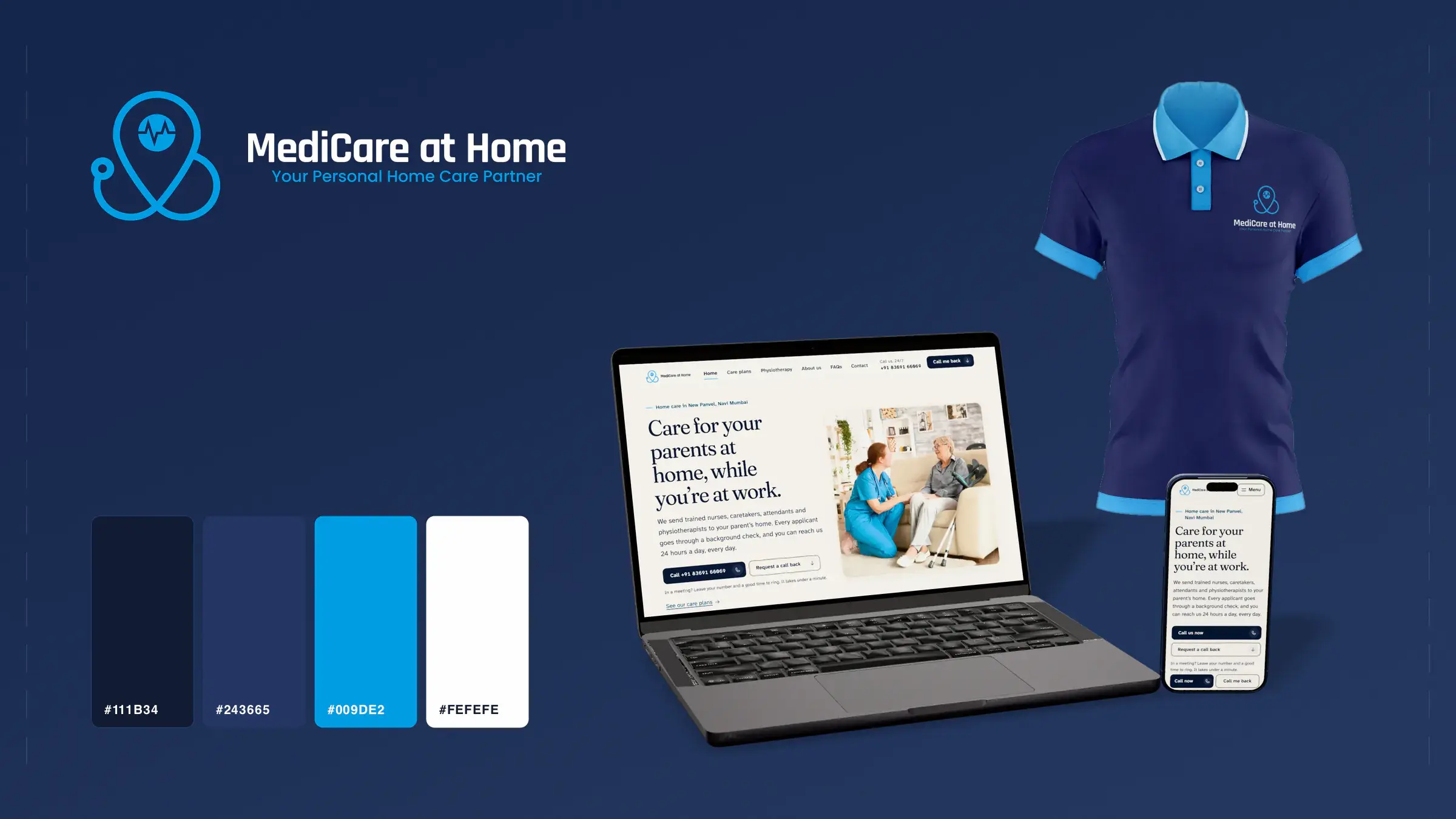
The brief
A name a family can trust at the door, and a site that makes choosing care simple.
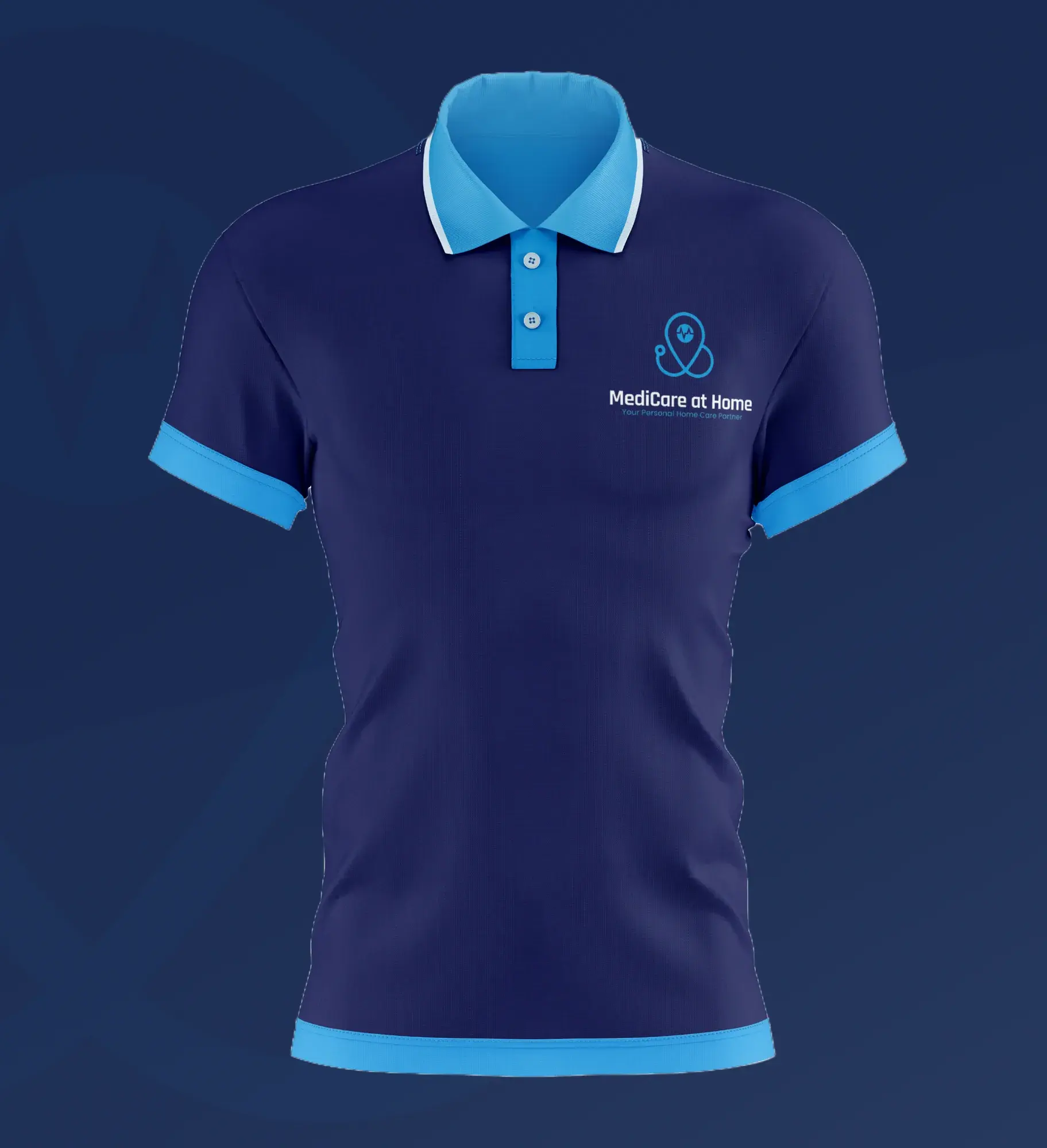
MediCare at Home sends nurses, caretakers, attendants and physiotherapists to patients’ homes. In 2024 we drew a stethoscope that curls into a location pin, set the brand in bright blue on navy, and designed and built the website. Cards, a staff uniform, a care-plans leaflet, staff ID and launch posts came with the brand. In 2026 we redesigned the site for the person who usually arranges the care: a son or daughter at work, often reading on a phone. It has a plan finder, a call-back form that needs only a name, a number and a time, and the number one tap away on every page.
The mark
A stethoscope that curls into a map pin
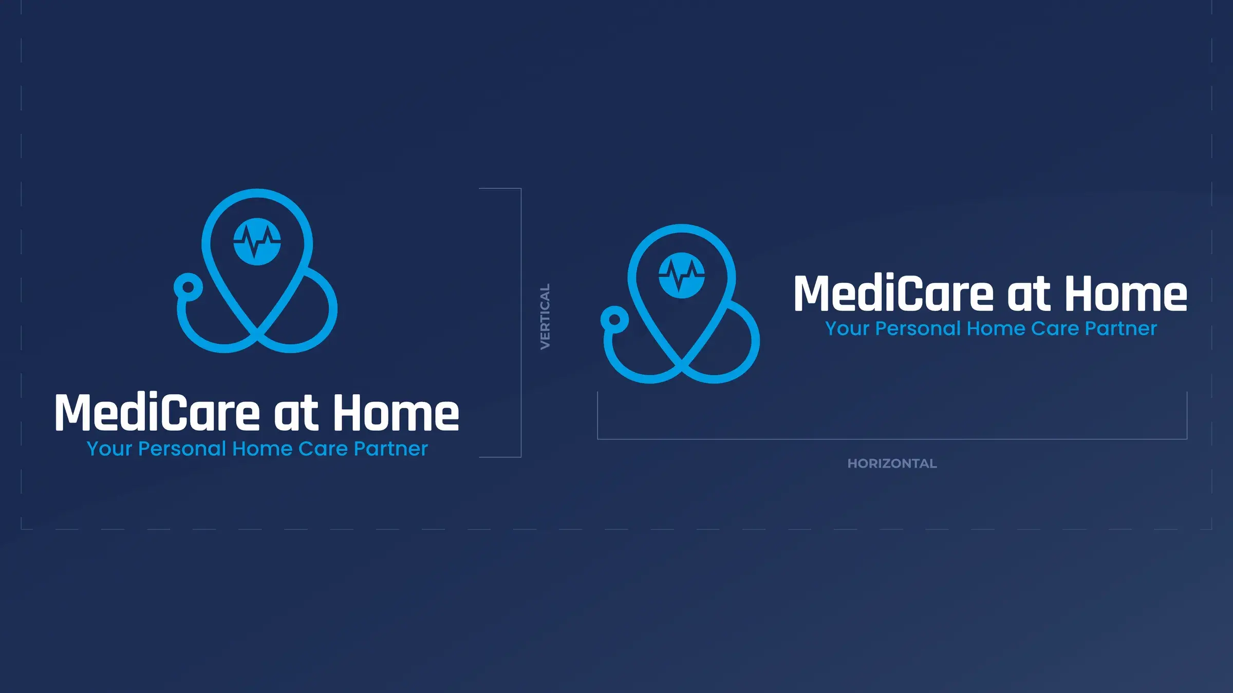
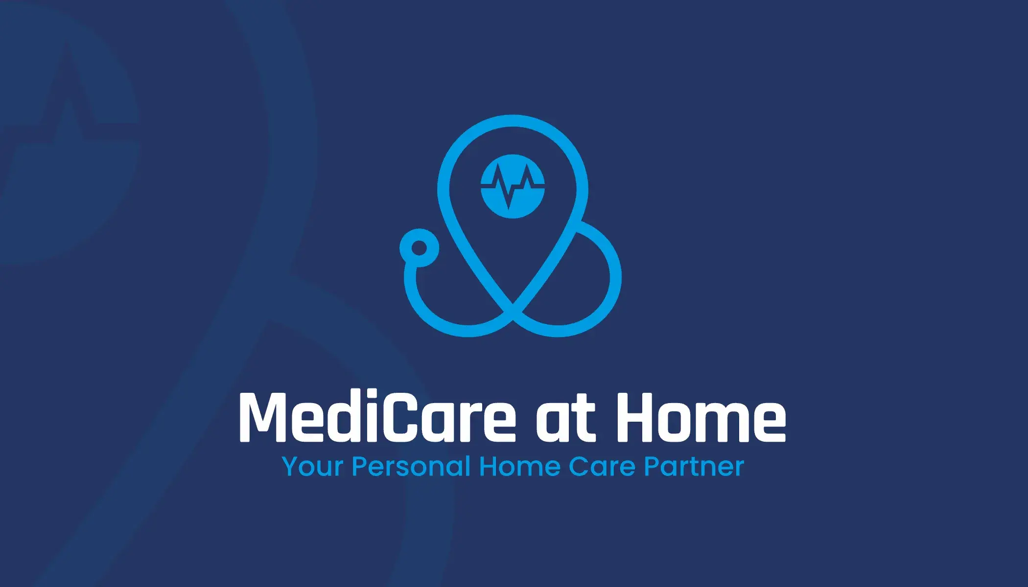
Care that comes to your address, drawn as one line. It works as a vertical and a horizontal lockup, as the icon alone, and as the name set on its own.
A map pinCare that comes to your address.
A pulseAt the pin's centre, so it reads as medical care, not only company.
A stethoscopeIts tubing loops round the pin and ties the mark together.


Colour and type
Night-shift navy and one bright blue
- Navy#111B34RGB 17 27 52The ground everything sits on
- Light navy#243665RGB 36 54 101Cards and panels
- Blue#009DE2RGB 0 157 226The mark, links and the pulse
- White#FEFEFERGB 254 254 254Type and the featured plan
- Light gradient#CDE7FF to #009DE2Button rings and highlights
Headings · Montserrat
Care for your loved ones
Body · Inter
Our clinical professionals are trained to ensure that patients receive proper treatment. We are available 24 hours a day, seven days a week.
Montserrat and Inter set the 2024 site. The 2026 redesign keeps this palette and the mark, and changes the type for its readers, as the website section below shows.
Who it’s for
For the son or daughter at work
The person reading is rarely the patient. It is their grown child: at work, short on time, and arranging care for a parent between meetings or late at night. In 2026 we redesigned the site we built in 2024 for that reader.
How we got here
“The older generation of people who have parents to take care of but have to do a job and are busy at work.”
This is a design synthesis, not a research study. It starts from the brief, and from how families in Indian cities usually arrange care for an ageing parent. We used this picture to make the design decisions below and to check them. The next step is to test it against real calls once the site is live.
- Drawn from
- The brief’s description of who calls
- The client’s own copy: plans, FAQs, why us and the about page
- The 2024 site, which we also built, on desktop and phone
- Not used, and not claimed
- Interviews, surveys, analytics, sample sizes or statistics. We didn’t measure anything, so there are no numbers here.
Who they are
- Working adults, roughly 40 to 60 and sometimes older, arranging care for an ageing parent while holding down a job.
- Usually the one sibling who “handles things”. Some live with the parent and are out all day. Others live in another city and arrange everything by phone.
- The parent may read the site too, over a shoulder or on a forwarded link. So the copy says “your parent”, not “dependants” or “beneficiaries”.
Their situation
- Something usually starts it: a fall, a hospital discharge, an operation, or a regular carer who left. That often means a deadline of days.
- Or it builds slowly: a parent who needs a bit more help every month, until the family can no longer cover it around work.
- They are letting a stranger into a parent’s home, often while nobody else is there. Trust comes before everything else.
- The decision is shared. A sibling or spouse has a say, and so does the parent, who may not want help at all.
When and how they use the site
- Mostly on a phone: in a lunch break, on the commute, or late in the evening after calling their parents. On a laptop at work if the office allows it.
- Often without their reading glasses, one-handed, in daylight, with other agencies open in other tabs.
- They skim for a few answers: what you do, whether you can handle my parent’s condition, who will come, whether I can trust them, how fast you can start, and how I talk to someone.
- Many will call rather than read. The site’s job is to get them to a person quickly, and to make them feel safe doing it.
Seven decisions
What that changed in the design
Each one answers a need in the picture above. Where it helps, we say what the 2024 site did.
The phone is one tap away on every page
The need
They want a person, not a process, and they have minutes, not an hour.
In the new design
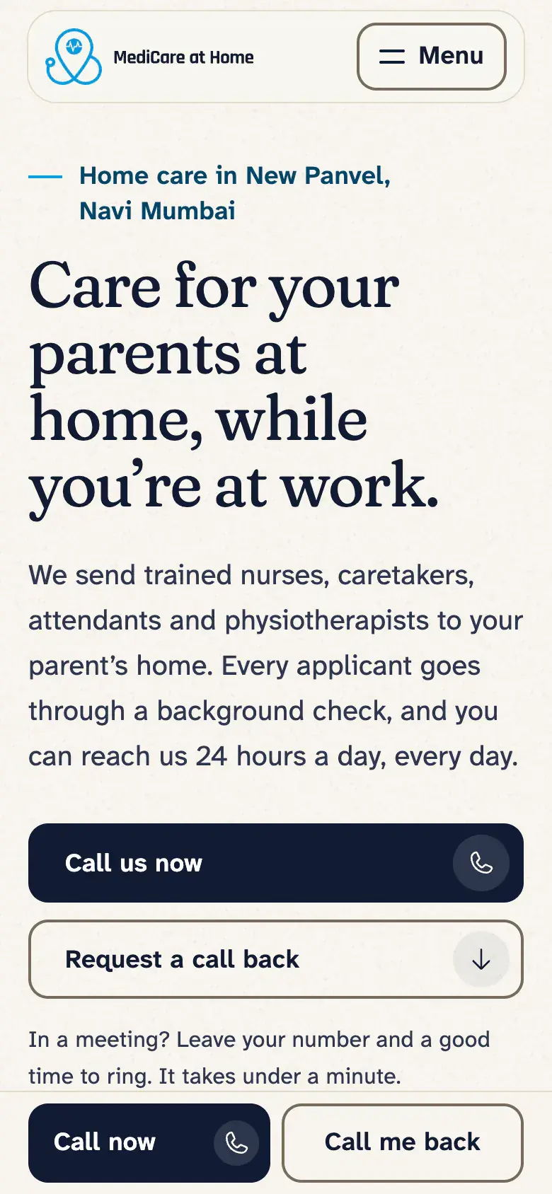
On phones, a bar fixed to the bottom of the screen holds “Call now” and “Call me back” on every page, and steps aside while the call-back form is on screen or the keyboard is up. On a wide screen, the header carries the full number under “Call us, 24/7”; narrower screens get a “Call us” button that dials it.
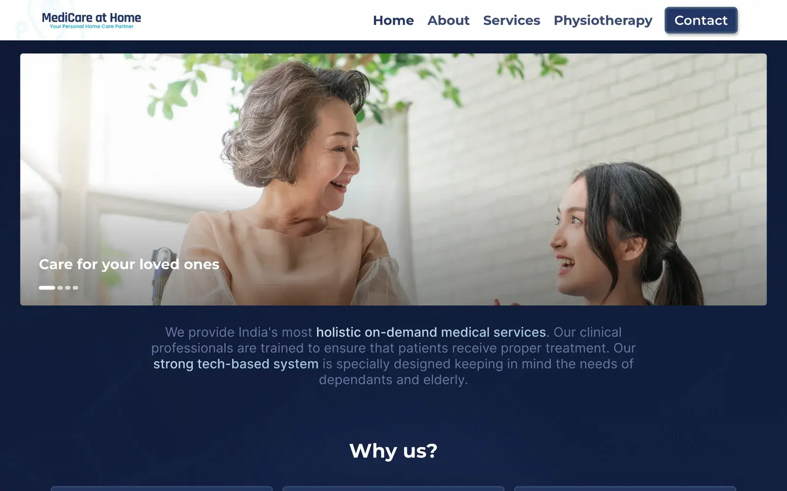
In 2024: The number sat under the contact form, below the plans and testimonials, with “+91” faded almost out of sight.
Type you can read without your glasses
The need
Many readers are past the age when close-up reading gets harder, and they often read on a phone in daylight with their glasses somewhere else.
In the new design
Body text is 18px on phones and 20px on desktop, and nothing is smaller than 16px. Running text has a line height of at least 1.6, lines run to about 62 characters at most, and every text colour has at least 7:1 contrast with its background.
A text-size control in the menu and the footer switches between Standard and Larger, and remembers the choice. The body face, Atkinson Hyperlegible Next, keeps 1, l and I apart, and 0 and O, which matters in a phone number.
In 2024: The type guide set body text at 16px and footer links at 13px, in light blue-grey on navy.
A call-back form you can finish in a work break
The need
They fill it in on a phone between meetings, and a missed call during office hours may not get picked up until evening.
In the new design
Only three answers are required: your name, your phone number and when to call, plus a consent tick. The short form at the foot of every page except Contact adds one optional question, the kind of care. The full form on the contact page asks a few more, each labelled “(optional)”.
“When should we call?” starts at “As soon as possible”, or offers windows through the day, including “Before work”, 7am to 9am, and “After work”, 5pm to 8pm. Pick a window and an optional day follows: any day, today, tomorrow or one of the next five by name. Text boxes are 56px tall with a visible label above and no placeholder, and every choice is a card at least 64px tall. A mistake is explained in plain words under the box or question it belongs to, and listed at the top of the form when you send it.
In 2024: Nine fields: name, surname, email, phone, city, state, postcode, service required and additional requirements. The only labels were placeholders, which disappeared as you typed.
Plans in plain words first, clinical words second
The need
They are choosing for someone else and often don’t know whether a parent needs a caretaker, a nurse or an attendant. Terms like “tracheostomy care” mean little to most people.
In the new design
Each kind of care is named with one plain line, on the home page’s cards and in the care plans page’s index:
- Caretaker: everyday help and company
- Nurse: medical care at home
- Attendant: hands-on personal care
On the care plans page, each plan starts with who it’s for and what the carer does, in plain sentences, before the client’s full lists. Some clinical terms are explained in place: “Intravenous (IV) therapy: medicines or fluids through a drip”, and gastrostomy as “a feeding tube into the stomach”. Customised is put plainly: pick any or all of the services in the Advanced plan.
Beside the plans on the home page sits “Not sure which one you need? Call us and describe a normal day for your parent.” The care plans page adds a plan finder: answer two questions and it suggests where to start.
In 2024: Each plan went straight into its lists. The nurse plan began with “Tracheostomy care”.
Reasons to trust, before the plans
The need
A stranger will be in their parent’s home while they are at work.
In the new design
The client’s own claims come first, in the opening lines and a plain list under them: calls answered 24 hours a day, a background check for every applicant, and a management team of doctors and healthcare professionals.
The three existing testimonials run word for word with plain credits, such as “A client of MediCare at Home”, and are held back until the client confirms the people quoted agreed. There are no badges, awards or figures the client can’t back up. The photos are still the licensed stock from 2024, never captioned as staff or clients, and we have asked the client for Indian photos to replace them.
Nothing moves while you read
The need
Rushed readers look away mid-sentence and come back, and a slide that has moved on loses them. We also want a reason for every movement.
In the new design
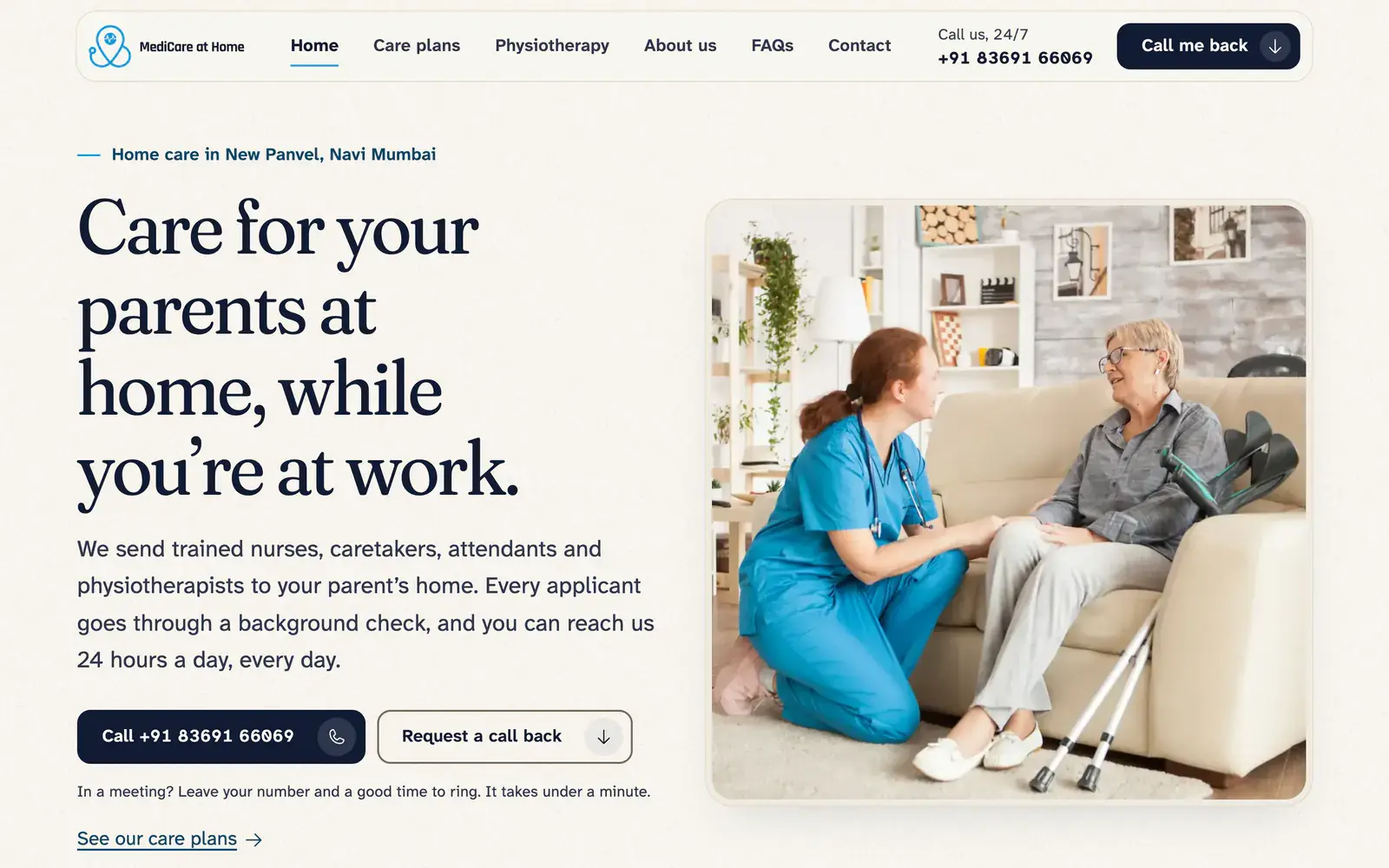
The hero is one photograph, one headline and a button that rings the number, with the number itself on the button from tablet width up. Headings, photos and the three plan cards settle in once as you reach them; body text, lists, phone numbers and form fields never move. The rest of the motion tells you something: a button pressing, the plan finder’s route line drawing on as you answer, or a form confirming it was sent. All of it switches off when the device asks for reduced motion, and scrolling is the browser’s own.
In 2024: The hero was a carousel of slides.
Answers where you look for them
The need
Most are buying home care for the first time, and want to know what happens after they call before they pick up the phone.
In the new design
The FAQs have their own page: eight plain questions with every answer visible, none folded away, and five of them on the home page too.
A “How it works” section, four numbered steps from the first call to care starting, is built as the home page’s second section. It is marked “Not ready to publish” until the client confirms what actually happens after a call.
In 2024: The design file had a frame for these steps, still waiting on a meeting with the client.
Empathy map
Arranging a parent’s care between meetings
The same reader from the inside. These are archetypes drawn from the brief, not real people, and the lines are illustrations. None of them are quotes from interviews.
Primary persona
The point person
The working son or daughter who is the family’s point person for a parent’s care. In their forties or fifties, in a full-time job, sometimes in another city from the parent, and arranging care in the gaps of a working day.
Also in view
- The adult child who lives with the parent but is out at work all day
- The sibling in another city who helps pay and checks in by phone
- The parent, who may see the site and should never feel talked about
Says
Out loud, to us and to family
- “Papa says he doesn’t need anyone. He fell twice last month.”
- “The hospital is discharging Aai on Saturday. Can someone start on Sunday?”
- “I’m in office till seven. Please call me after that.”
- “Will it be the same person every day, or someone new each time?”
- “What’s the actual difference between a nurse and an attendant?”
Thinks
What they might not say
- “A stranger will be alone in the house with her all day. Who is this person?”
- “If something happens during my meeting, will anyone tell me?”
- “I should be the one doing this.”
- “Can we keep paying for this month after month?”
- “My brother will ask why I picked these people. I need a good answer.”
Does
What they actually do
- Searches on the phone in a lunch break or on the commute, with three or four agencies open in tabs.
- Forwards the link on WhatsApp to a sibling or spouse before deciding.
- Asks the family doctor, the hospital desk or a neighbour for names they trust.
- Reads late at night after calling the parents, then calls the next morning.
- Holds the phone at arm’s length or pinches to zoom, because the reading glasses are on the office desk.
Feels
What sits underneath
- Guilty about not being there in person.
- Rushed, because a discharge date or a carer who left without notice has set the deadline.
- Wary of being overcharged or let down.
- Relieved when a real person answers and understands the parent’s condition without a long explanation.
- Worn out, because care has become a second job on top of the first.
Pains
What gets in the way
- Can’t take long personal calls at work, so a missed call can wait until evening.
- Doesn’t know which kind of help the parent needs, or what the clinical terms in care plans mean.
- Can’t see what happens in the parent’s home from day to day.
- Small, faint text, long forms and moving banners on a phone, read without glasses.
Gains
What would help
- One number where a person answers, day or night.From the client: 24/7 support
- Knowing the carer has been background-checked, and that doctors and healthcare professionals are behind the team.From the client: background checks, and doctors in the management team
- A plan that fits the parent now and can change as their needs change.From the client: every plan can be customised
- Everything arranged in one call, or a call back at a time that fits the working day, with the parent staying at home where they’re comfortable.
The website
Built for someone booking care for a parent
Six pages, redesigned for that reader: home, care plans, physiotherapy, about us, FAQs and contact, on desktop and phone. The site is built. It goes live once the client confirms a few dozen facts only they can give, such as whether calls really are answered at any hour and how soon care can start.
Before and after
Both home pages are ours. The redesign keeps the mark, the navy and the blue, and sets them on warm paper in Fraunces and Atkinson Hyperlegible Next.

The plan finder
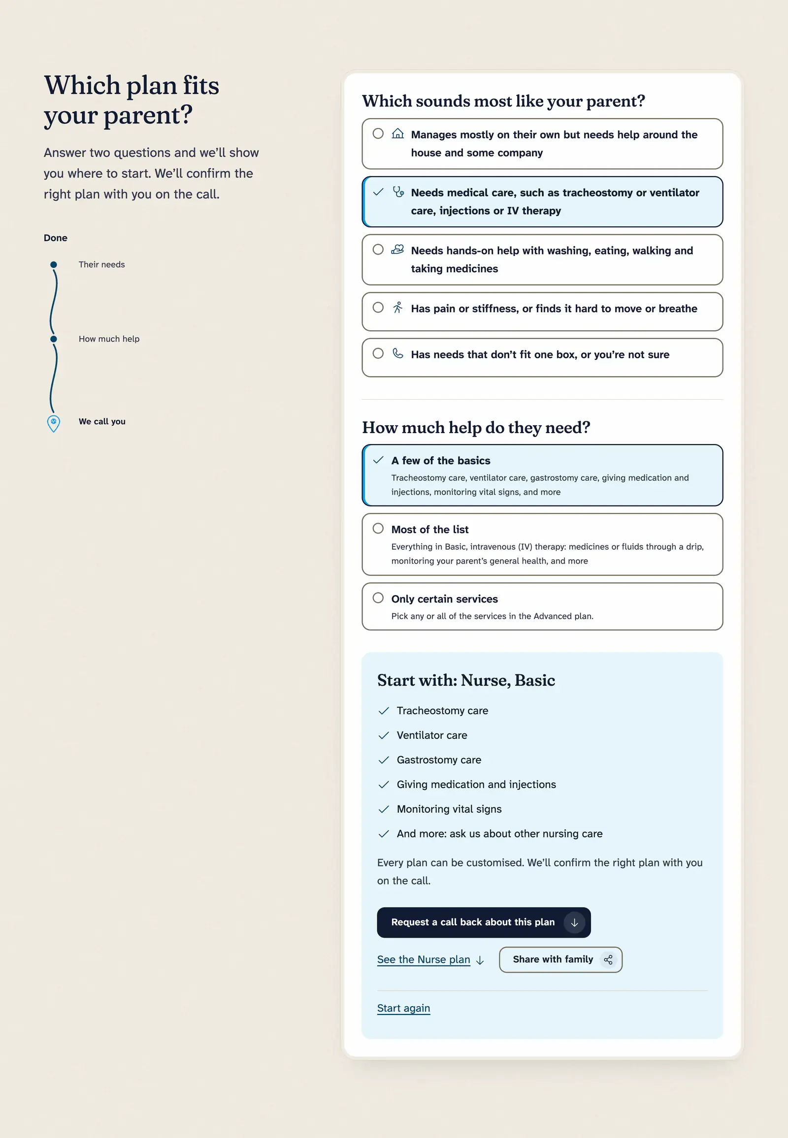
For a family that doesn’t know whether a parent needs a caretaker, a nurse or an attendant. On the care plans page, two questions: which sounds most like your parent, then how much help they need.
Beside them, a route line drawn like the stethoscope’s tubing in the logo fills in as you answer, from “Their needs” through “How much help” to the pin: “We call you”. The result names a plan and a level with its list, and its link keeps the answers, so “Share with family” sends a sibling the same suggestion.

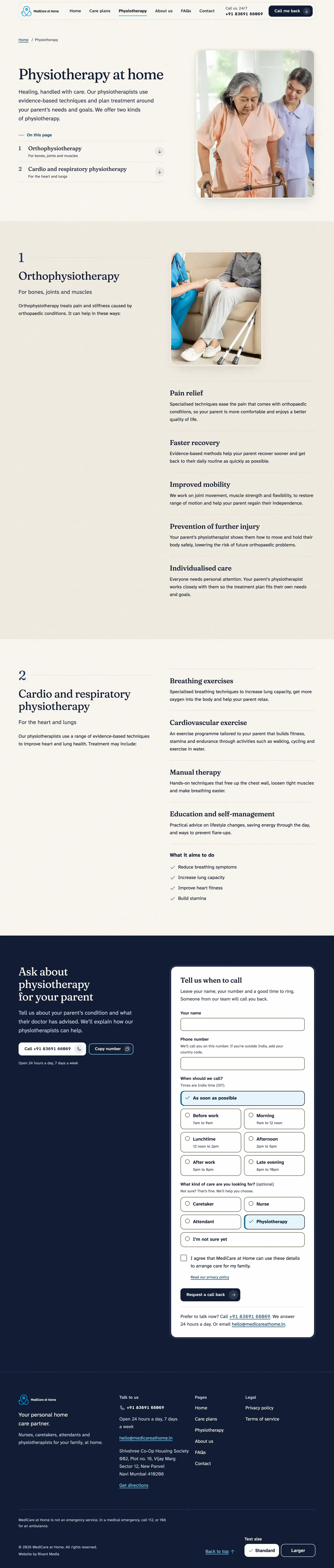
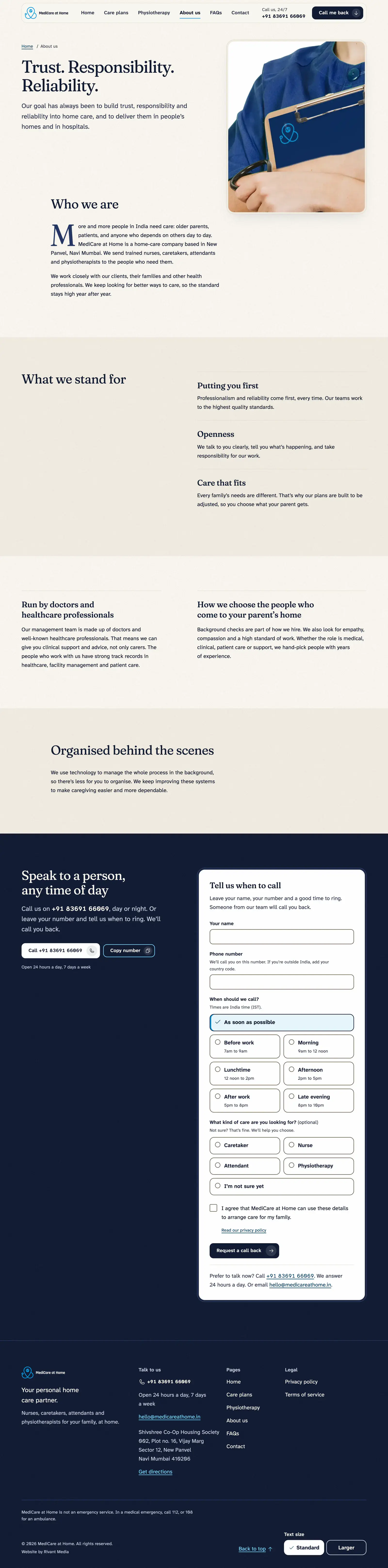
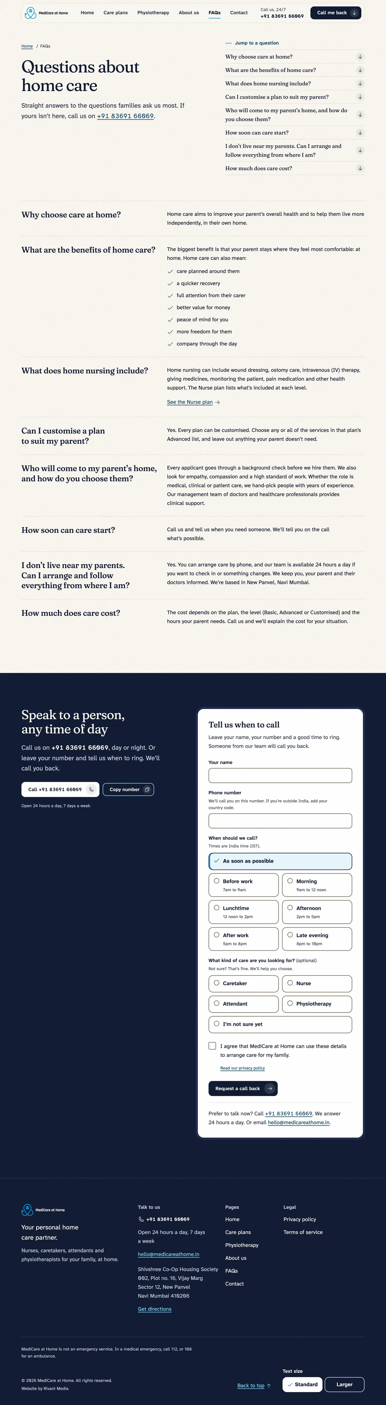
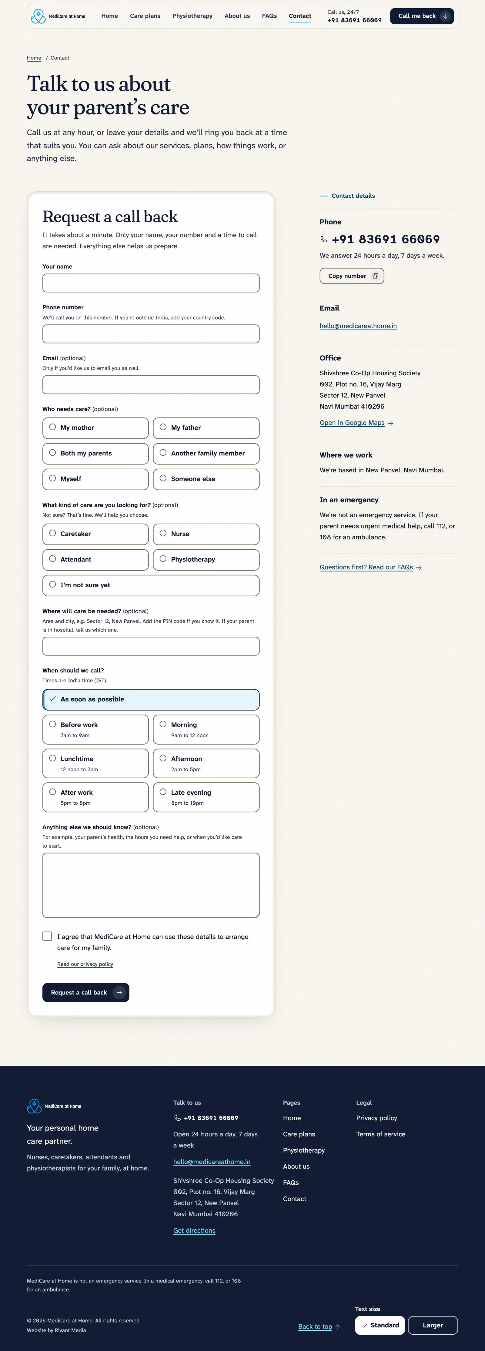
Every page but Contact ends on a navy back cover, as a brochure does: the number to call or copy, and the short call-back form beside it.
On a phone
The same site, in one hand
Most readers meet the site on a phone, often in a work break. Every page stacks into one column, so nothing sits hidden off the edge of the screen, and “Call now” and “Call me back” stay in a bar at the foot of it.
In 2024: the plans were a row you swiped sideways, and the number sat under the contact form.

Home

Care plans

Contact


Print and uniform
What the staff carry and wear
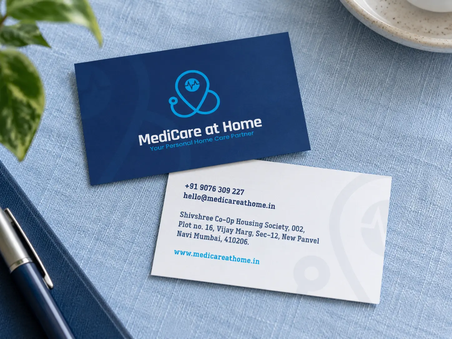
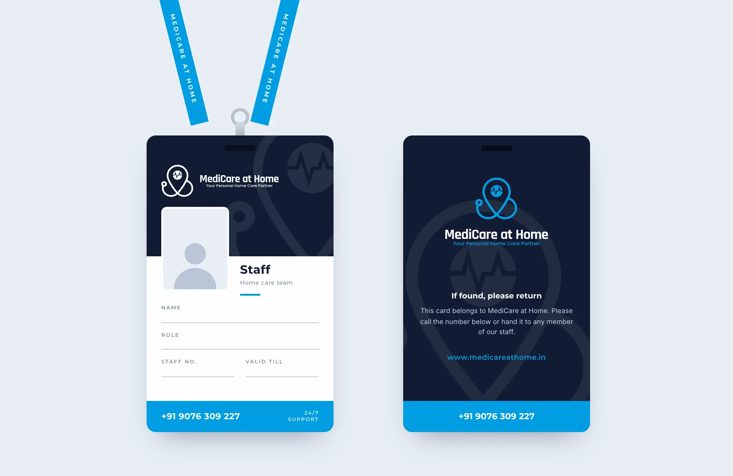
The brand as drawn in 2024, on what the staff carry and wear, and on what the company posts.

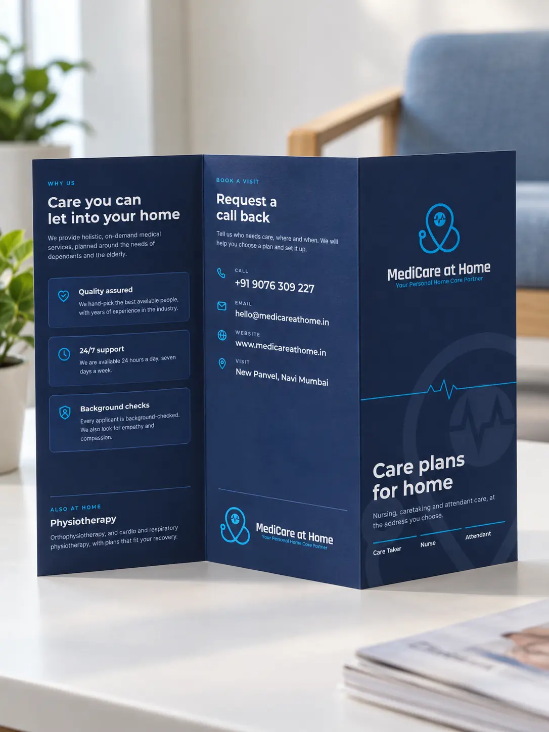
Care plans in print
The plans, on paper and on the feed
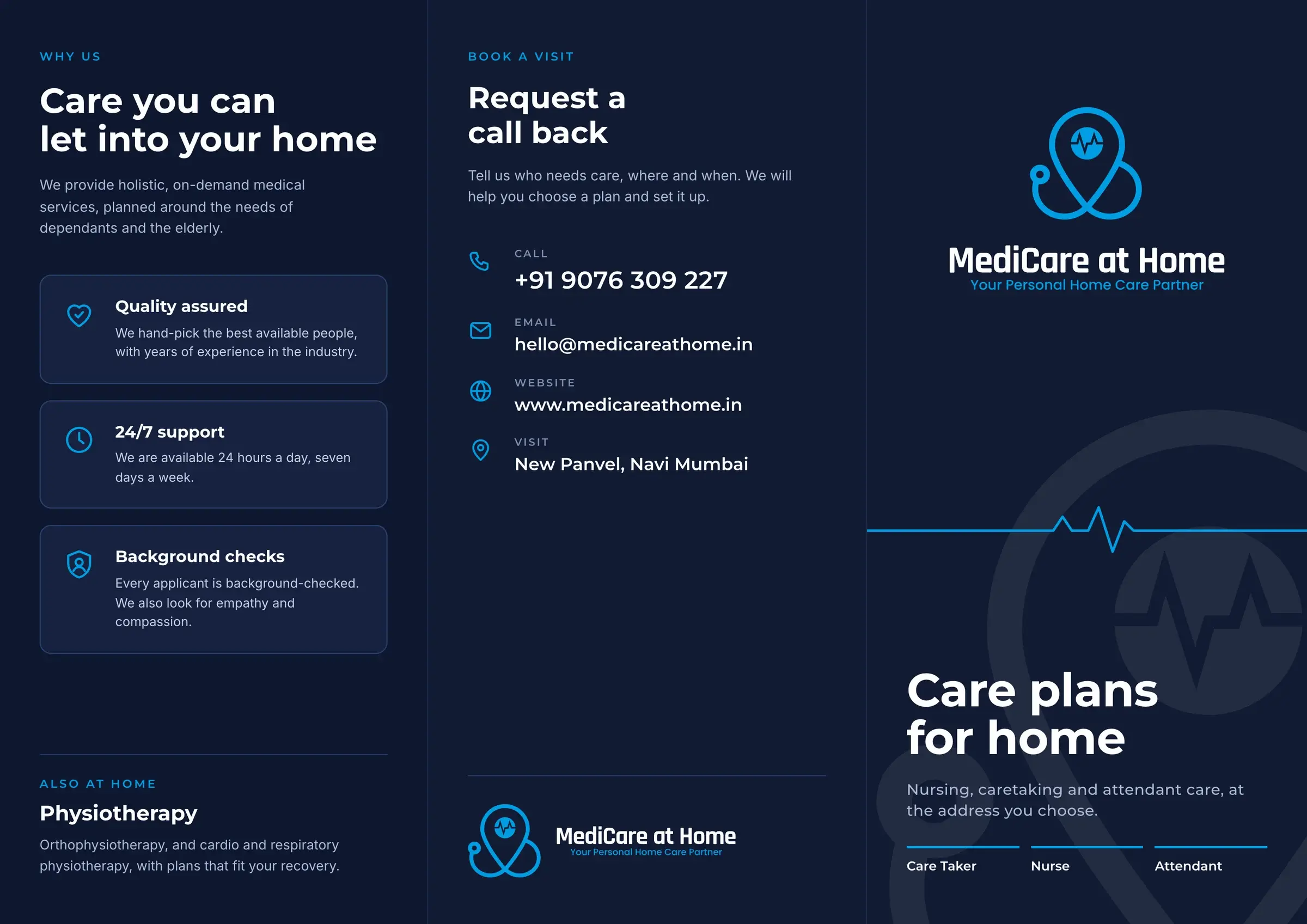
A tri-fold leaflet sets out all three plans, word for word from the 2024 site, for a family to keep by the phone. The staff card puts the number on every visit.
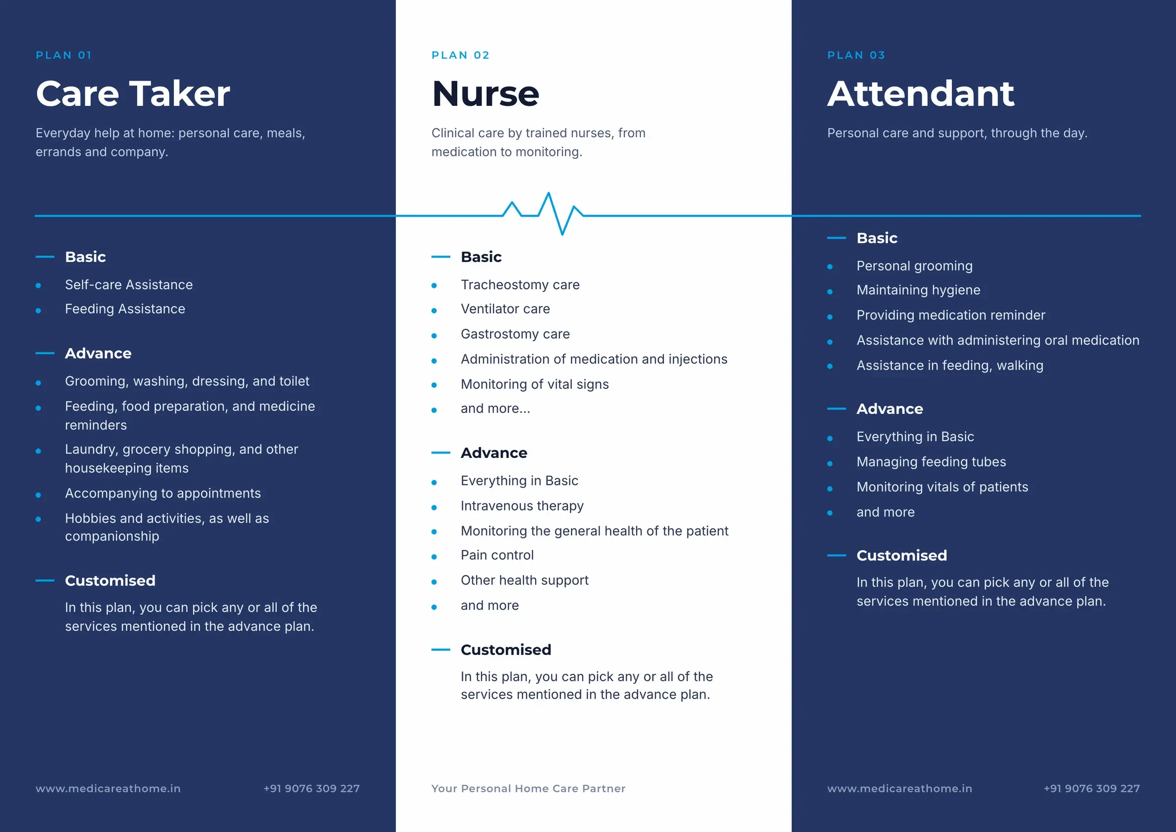
Inside, A4 folded to three panels: one plan to a panel, the nurse plan in white, the pulse running across all three.
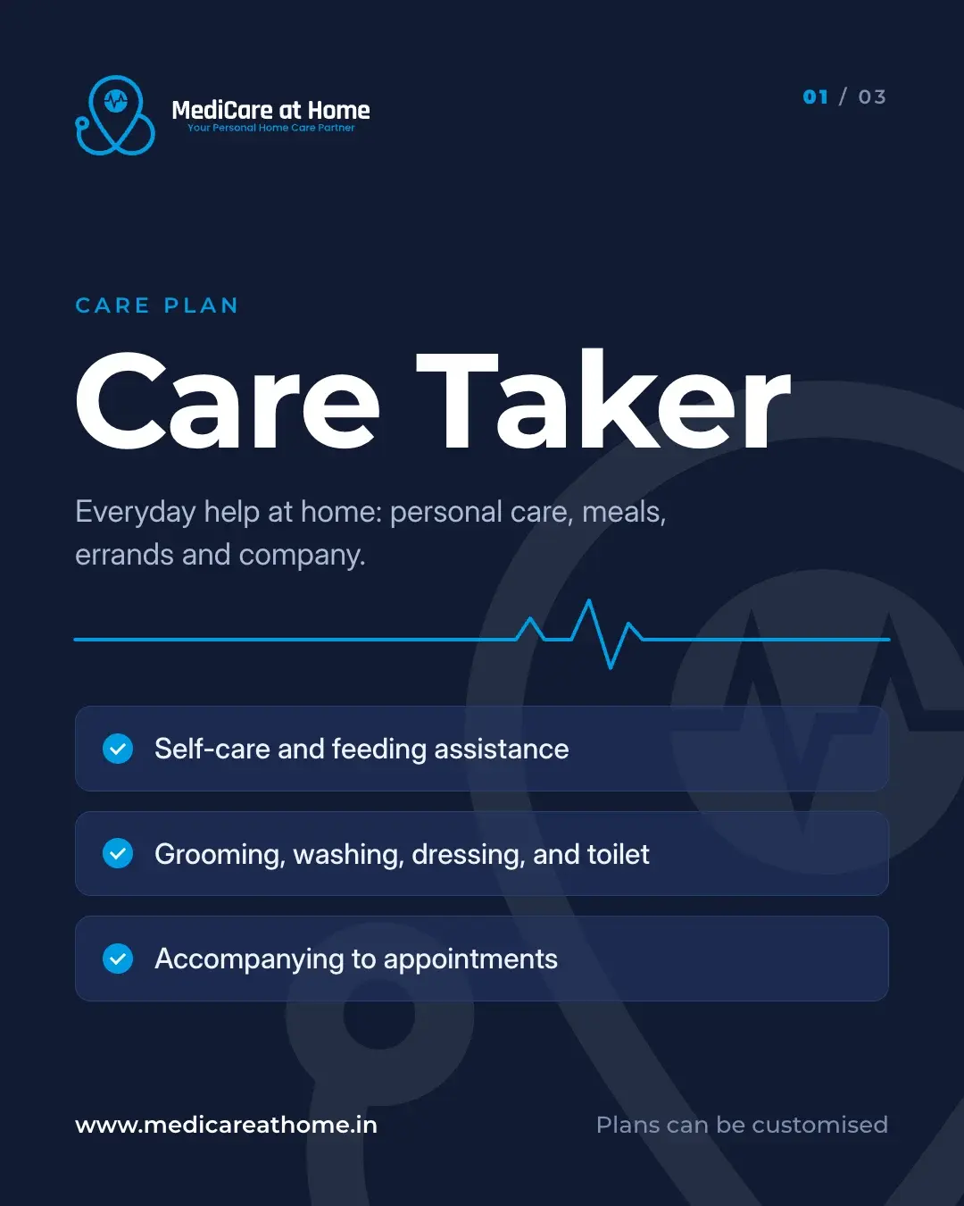
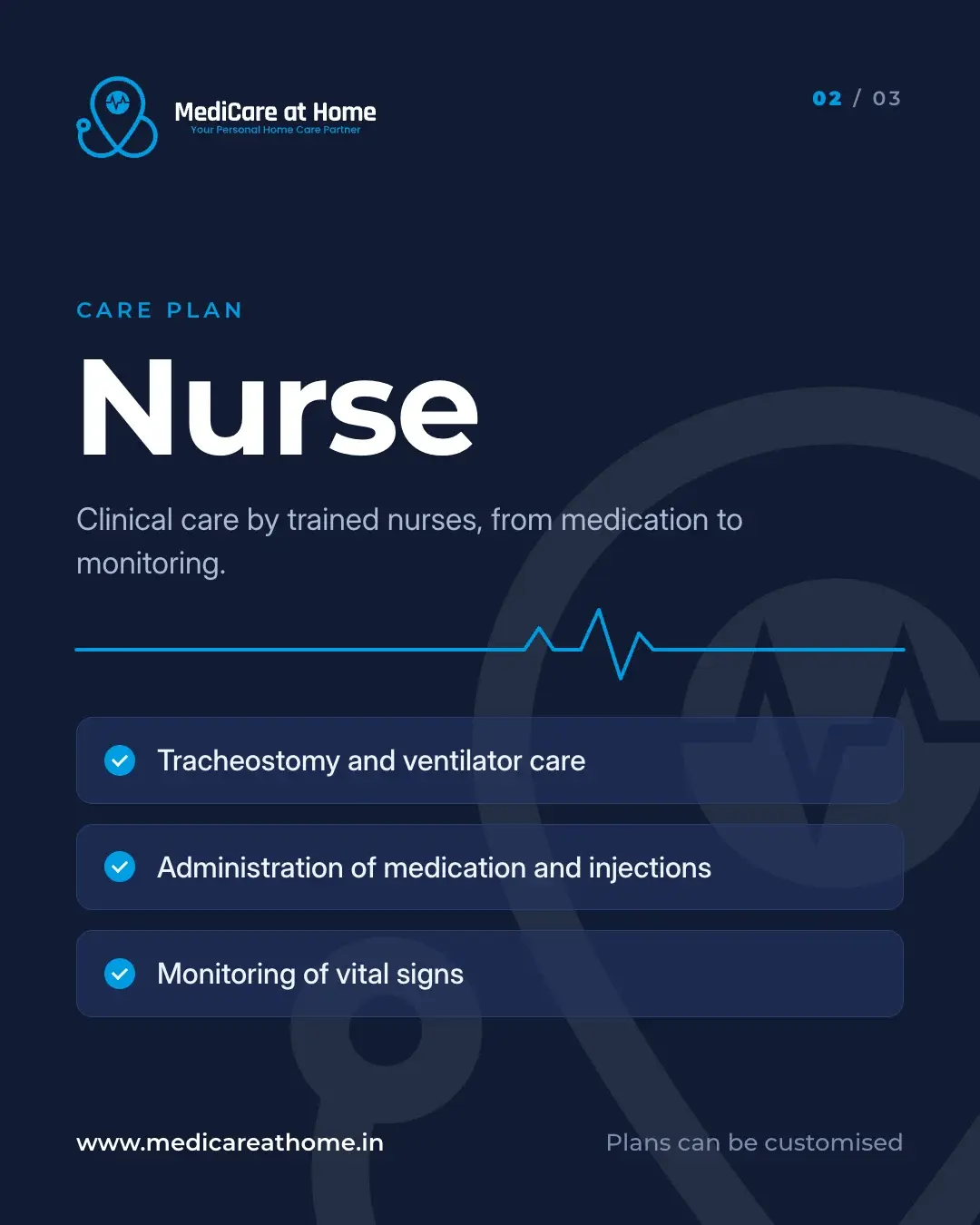
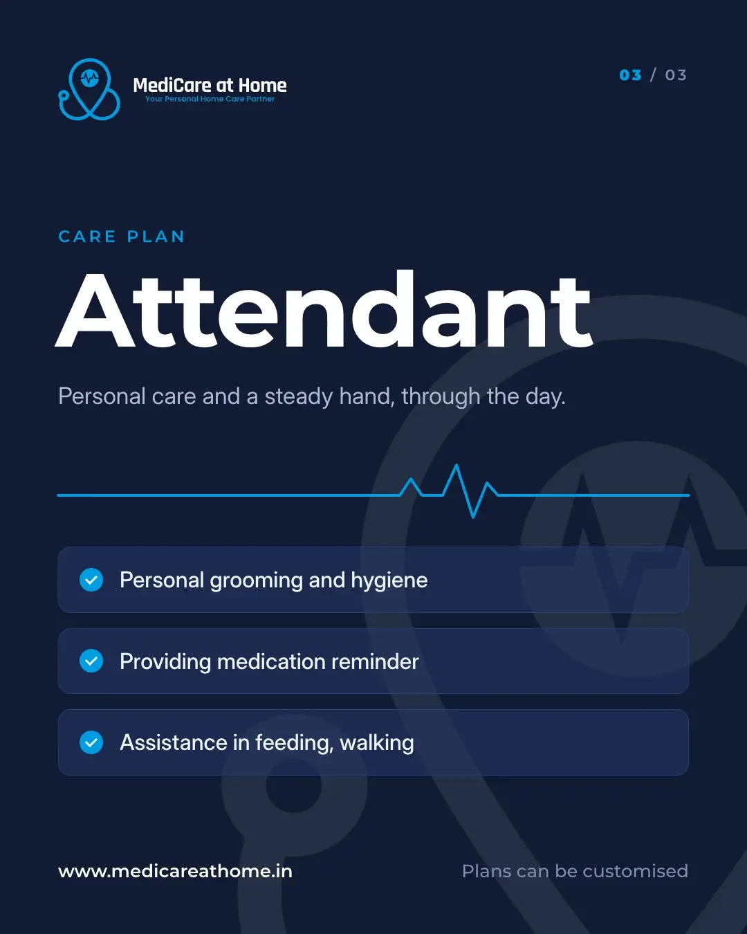
One post for each plan
Following the launch post: the plan’s name large, three things it covers, the mark faint behind.
Credits
- Client
- MediCare at Home
- Industry
- Healthcare / home care
- Year
- 2024, redesigned 2026
- Services
- Identity design
- UI/UX design
- Website development
- Print design
- Social media design
- What we made
- Logo and lockups
- Colour and type
- Website design and build (2024): home, about, physiotherapy, plans, desktop and mobile
- Business cards
- Staff polo
- Launch post
- Care-plans leaflet
- Staff ID card
- Plan posts
- Audience synthesis and empathy map
- Website redesign (2026) for working families: home, care plans with a plan finder, physiotherapy, about, FAQs and contact, desktop and mobile